Transforming their online presence
LA SkyRail Express

Opportunity
The LA SkyRail project presented a unique opportunity to revolutionize the way Los Angeles residents perceive and interact with public transportation. However, the potential success of this revolutionary transport system was hindered by a lackluster digital presence and an absence of a cohesive brand identity.
Approach
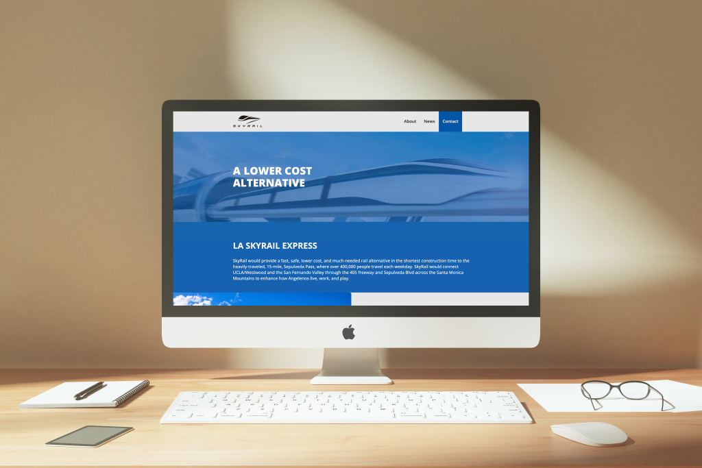
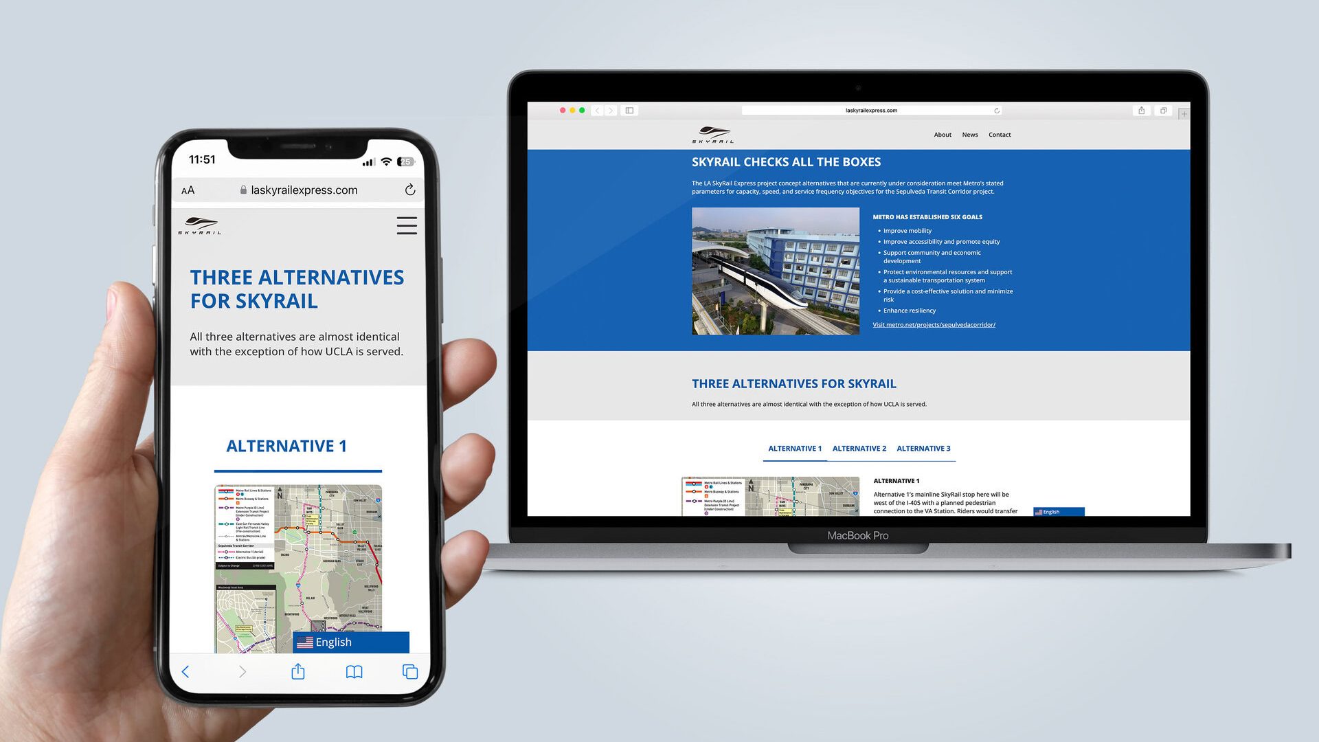
Celtis approached this challenge with a two-pronged strategy: First, by redesigning the LA SkyRail website to make it more intuitive, engaging, and mobile-friendly, focusing on user experience to effectively communicate the benefits of the SkyRail. Second, by developing a new logo and brand identity encapsulated in the “Look Up” campaign, aiming to evoke excitement and anticipation for the future of L.A. transportation.

Outcome
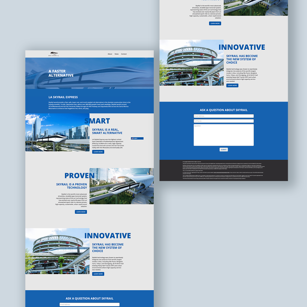
The website’s transformation resulted in a dynamic, easy-to-navigate platform where users could find detailed information about the SkyRail, fostering an informed and engaged community. The “Look Up” campaign successfully rebranded the LA SkyRail, creating a recognizable and forward-thinking image that resonated with the public and stakeholders alike.
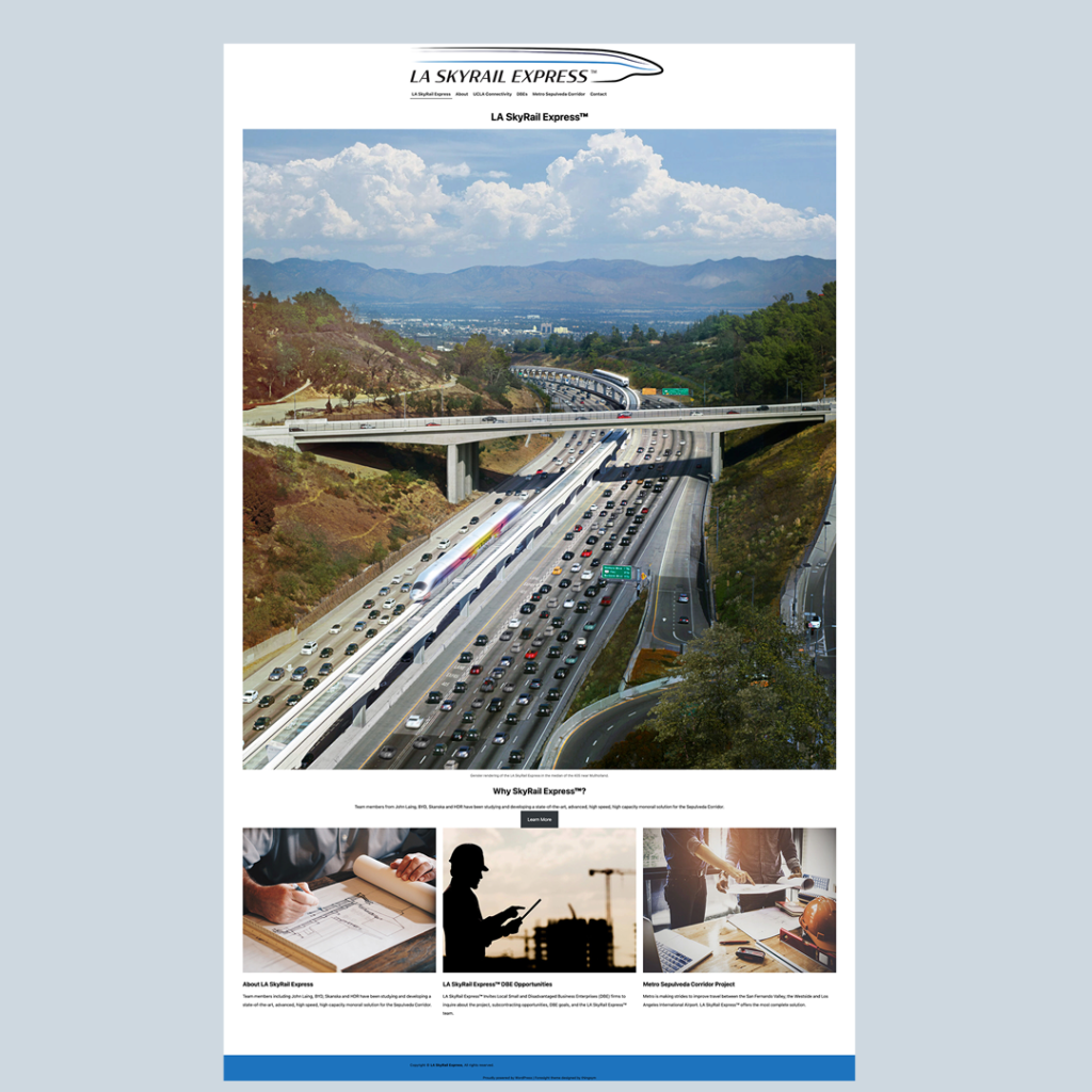
Before

After
